| Home | Previous Lesson: TreeView Next Lesson: RichTextEdit Control |
Tab control allows you to paint personal organizer like user interface. Did you observe that you have been using tab control? The properties pane of any control uses tab control. Tab control is new to version 5.0, till then programmers were simulating tab control with the help of User objects.
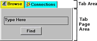
Place a tab control on the window. By default it has one page. To insert more pages, click with the right mouse-button in the Tab Area shown in the picture and select Insert Page option. Clicking in the Tab Area allows you to select properties for the tab control, Clicking in the area Tab Page Area allows you to specify properties for the selected tab page, First let us see the tab control properties.
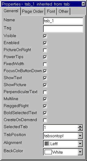
PowerTips: By turning on the PowerTips property, you can display PowerTips for the page names, similar to the PowerTips for the toolbar icons.
FixedWidth: By default, the tab size automatically adjusts to the width of the tab page name. That means, the area that displays the tab page name may be longer and sometimes shorter, depending on the length of the tab page name. To make all tag pages' tab to have the same width, turn on FixedWidth property. In this case, the tab page's tab width is decided by the longest tab page text.
FocusOnButtonDown: This property is similar to FocusRectangle property of other controls. Turning on this option would display a dotted rectangle line around the tab page name whenever user clicks on the tab page and brings the tab page to the front.
In a given situation if you don't want to display the tab page text (We don't see any need), just turn off ShowText property. While this property is off, tab page text will not displayed even if the tab page has some text. Similar to the menu object, you can assign a picture to each tab page. Similar to the ShowText property, you can turn on/off ShowPicture property.
PerpendicularText: By default, a tab page name is displayed horizontally. If a need arises, the name can be displayed vertically. Turning on the PerpendicularText property can do this. Similarly you can display text in multiple lines by turning on MultipleLines property.
Turning on the RaggedRight property stretches the right most tab till the edge. To test this, insert two more tab pages by selecting InsertPage from the popup menu. Turn this property on and off and see how it works. BoldSelectedText property as the name suggests makes the selected tab page's text bold.
In cases where there are more tab pages than the number of tab pages that can fit in the display area, PowerBuilder automatically displays scrollbar icons. The position of the icon depends on the TabPosition property. TabPosition property gives a wide choice of area to display the tab page text.
Once the tab control is painted, you may want to rearrange the tab pages. Dragging and rearranging in the Page Order tab in the property sheet rearranges the actual tab pages.
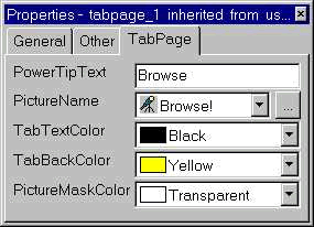
Wondering where to define picture name, text for PowerTip, etc.; Click on the page itself (Tab Page Area). You can define name for each tab page, tab text, text color, tab color and picture for the tab page in the properties pane.
| Home | Previous Lesson: TreeView Next Lesson: RichTextEdit Control |