| Home | Previous Lesson: DropDownListBox Next Lesson: RadioButton |
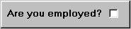
A CheckBox is used to select or deselect a given option. For example, you may want to find whether the user is employed or not? You can achieve this with the help of a CheckBox.
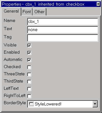
If required, a CheckBox can have a third state, which means either undecided or a mixed state. This option is activated by checking the control's ThreeState property.
A better example of the ThirdState property would be a part time job. This position is neither full time employment nor un-employment.
Checked/ThirdState: The default value of a CheckBox is unchecked, but you can change this by selecting either Checked or ThirdState properties.
Selecting the ThreeState property allows the CheckBox to have three states and selecting the ThirdState property makes the ThirdState the default state.
LeftText: The LeftText property displays the text to the left of the CheckBox. By default, the text display is on the right side and the CheckBox on the left side. Deselecting it reverses the order, placing the CheckBox on the left of the text.
Automatic: By default, Automatic property is turned on. When this option is turned on, at run-time, the CheckBox automatically changes the state (checked/ unchecked/ third state) as the user clicks on the CheckBox control. If the option is not turned on, you need to change the state programmatically.
 Place a CheckBox control on the window.
Turn on/off LeftText property and preview the window each time.
Turn ThreeState property on/off, and preview the window each time and click on the control few times while previewing.
Turn off the Automatic property and preview the window and click and see whether it will automatically change the status or not.
| Home | Previous Lesson: DropDownListBox Next Lesson: RadioButton |