
| Home | Previous Lesson: DropDownPictureListBox Next Lesson: TreeView |
In simple terms, a ListView control has functionality similar to that of a PictureListBox. However, a ListView is more flexible and allows you to develop more user-friendly applications. Recall that in a PictureListBox you can assign pictures to each item, where as in a ListView, each item can be associated with three pictures. One Large picture, one Small picture and one picture to indicate the state of the item. You can display a ListView in different presentation styles:
The following four pictures from the Examples application illustrates different views of a ListView control.
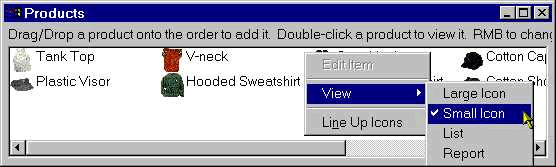
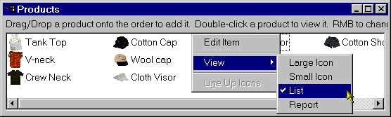


If you select FixedLocation property, users can't move the items in the ListView control at run-time. Otherwise, users can drag and arrange the icons, to suit their needs.
You can allow the user to edit labels at run-time similar to the way you rename the Icon labels on your desktop, by turning on EditLabels property. You can also allow the user to delete items, by turning on DeleteItems property. The label may overlap other labels if it is very large. It would be always better to check LabelWrap property.
ExtendedSelect allows the user selecting multiple items using Shift/Control +Click/Arrow key or by clicking outside any label area and drawing a rectangle in the control. In the second method, all controls that falls into that rectangle are selected.
It is a good idea to preview the window each time you enable/disable property for the ListView control. This way, you understand it better. When selected, you may not be able to see the affects of ReportView style. You need to do some programming to view, how a ListView control looks like in ReportView style. So let us skip this part until we teach you about PowerScript.
Turning on ButtonHeader property displays the column titles as buttons in Report view which is the default behavior; otherwise, column titles are displays as regular labels.
All the following properties are introduced with v7.0.
In the report view, clicking on the first column in a row highlights that field only by default. Turning on FullRowSelect property highlights the full row when clicked on a row.
A new event 'ItemActivate' is introduced with v7.0. OneClickActivate, TwoClickActivate fires ItemActivate event when clicked once or twice (not double-click) respectively. If none of these two properties turned on, double-click fires ItemActivate event. You may not find this property interesting unless you write some script for the control.
GridLines option allows you to display grid lines between each column in the report view�similar to the Grid presentation style DataWindow.
You can display the state of the item with a CheckBox instead of using state images, which makes things easier.
TrackSelect property when turned on highlights an item when mouse passes over and selects the item when the mouse pauses over it.
UnderlineHot, UnderlineCold properties work in conjunction with OneClickActivate property. When turned on, underlines the hot item (the highlighted item on which the mouse pointer is located) and cold items (all non-highlighted items) respectively.
HeaderDragDrop, when turned on allows the user moving columns by dragging column headers similar to the Grid presentation style DataWindow.
| Home | Previous Lesson: DropDownPictureListBox Next Lesson: TreeView |