| Home | Previous Lesson: OLE Control Next Lesson: Graph Types: |
PowerBuilder allows you to add a Graph to your window with the help of this control, in any of the common graphical formats to present the numerical data.
There are numerous options for the properties of this control relating to titles, legends and axes, as well as the type of graph.
We won't go into details about it here. In comparison with Graph presentation style DataWindow, usage of a graph control in a Window is rare. So it is better to learn about Graph control once you complete DataWindow session.
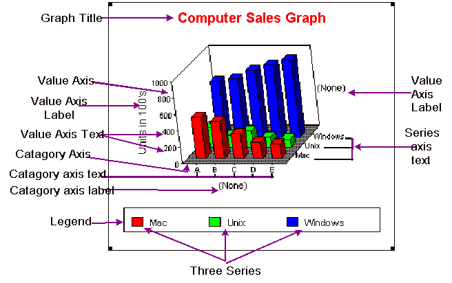
PowerBuilder Graph Terminology
Category: Categories are the major divisions of data. For example, we can divide all transactions into three major divisions (types) like 'Receipts', 'Issues', 'Returns'. In the above graph, there are three categories.
Series: Suppose, say you are comparing transactions for two products then, you will find receipts for each product, issues for each product and so on. In this example, each product is a series. Series are a set of data points. Let's take another example, say you are comparing transactions of a product for each month. Here you have 12 series, which means that you are comparing receipts for each month, issues for each month as well as returns for each month.
Values: This is the value of each series or category (if no series are present). The total number of receipts, total number of issues and total number of returns are values. Display of 'value' varies between graph types.
Title: The title of the graph. By default it appears at the top of the graph.
Category Axis: Category axis is the axis where the categories (major divisions of data) are plotted. Typically it is on the x-axis.
Series Axis: Series axis is the axis where the series (set of data points in a category) are plotted. In two-dimensional graphs this is on the same axis as the category axis. In three-dimensional graphs it is different from the category axis. You can see this in the graph above.
Value Axis: Value axis is the axis where the values are plotted. Typically it is on the Y-axis and varies in different graph types.
Legend: Legend displays how the series are represented. For example, you may have different colors for receipts, issues and returns. You can see the legend at the bottom of the above graphs. You can display legend at different places on the graph such as bottom, top, left, right, etc..
Ticks: Ticks displays the starting of another value on the value axis and represents categories on the category axis. You can display these ticks inside, outside or straddle (half on inside and half on outside) the axis. You can display ticks for major divisions as well as minor divisions. For example, the major division is 500 and if you want to display 4 minor divisions then PowerBuilder will display a minor division tick 4 times (after every 125) between each major division. The ticks for minor division can't be a straddle. Similarly, you can display label for each major division, but not for minor division.
| Home | Previous Lesson: OLE Control Next Lesson: Graph Types: |