| Home | Previous Lesson: PictureButton Next Lesson: Code Tables |
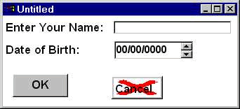
The EditMask control allows you to take formatted input from the user. For example, you might want to accept zip code from the user in the format #####-####. If the user tries to input information into this control that doesn't conform to the mask, PowerBuilder refuses to accept the keystrokes.
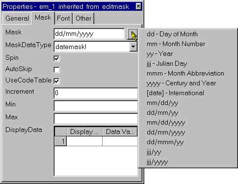
Under the Mask tab page, there are several data types available for the MaskDataType DropDownListBox. For each of these data types, there are some pre-defined masks available. For example, if you select the String data type, you can format the data in upper case (!), lower case (^), number (#) and alphanumeric (a) characters. Most of the times, these masks are enough for your needs. If you need a special mask, you can as well create them by typing into the Mask option.
Note that the formatting of data is for display purpose only. PowerBuilder doesn't store the data in the way it is displayed, in particular "date" type. Dates are usually stored as a number representing the number of days from a fixed date. This allows PowerBuilder to easily swap between formats by simply applying the rules for the given format to this base number, rather than performing two conversions and remembering what format the date is currently stored in. For example, if the fixed date is 1st January 1994, then 3rd January 1994 would be stored as 2 and the 25th December 1993 would be stored as -7. The point is that it doesn't matter to us how PowerBuilder stores the date as long as we see it in a format that we understand and require.
In versions prior to v5.0, there was an option in the dialog box to test the mask you defined. However, it is no longer available in v5.0. You need to either preview or run the window to test the defined mask.
One note from our experience is that, make sure you paint enough space (may be a little extra than required) for the content to display in the EditMask. For example, if you paint the height a little shorter for the SingleLineEdit control, user can still type in data even though he can't read the data comfortably. If you do the same to the EditMask control, it displays no data at run-time.
AutoSkip is one of the interesting properties. If you turn on this property for an EditMask control, focus will automatically jump to the next control in the Tab List (We will explain in a moment) when the user has completely filled the mask with the input. User doesn't need to either press tab or click with the mouse-button to jump to the next control.
The Spin Control property is most often used with numeric data to allow the user to increase or decrease the value in the EditMask control by clicking on the arrows that appear at the corner of the control. You can see this property in the print dialog box while specifying the number of copies to print, in any application under MS-Windows.
You can enter the relevant information in the appropriate fields to specify the minimum and maximum values for the control and the size of the increment (which must be a whole number).
You can also use the spin control option for the "date" data type fields. In this case, only one part of the date will increment or decrement depending on the cursor position. For example, if the cursor is on the month part of the date, clicking on the upper arrow will increment the month by one.
While previewing the window, you won't be able to click on the spin control arrows because you are previewing the window.
If you type in a value which is outside the allowable range, as soon as you try to increment or decrement it using the spin control, the value will change to the minimum or maximum value and won't allow you to move outside this range.
| Home | Previous Lesson: PictureButton Next Lesson: Code Tables |