| Home | Previous Lesson: Types of Menus Next Lesson: Cascading Menus |
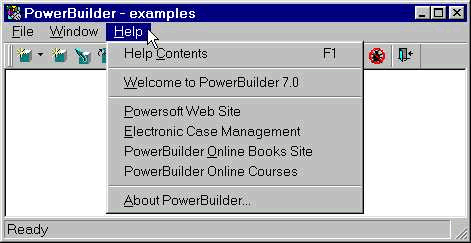
DropDown menus are displayed when you select an option from a menu bar that is on the topside of a window. The available options are grouped into logical collections and the group names are displayed horizontally on the menu bar. The following picture illustrates a typical DropDown menu.
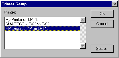
Selecting a menu option that has � (ellipses) would bring up a response window for getting more information. For example, selecting the Printer Setup menu option would display Printer Setup dialog box, which is a response window (You cannot do anything in the application unless you close the response window).
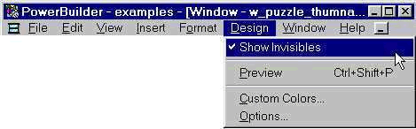
Some of the menu options work in toggle mode, i.e. clicking on a menu option would turn it and selecting it again would turn it off. An example of it would be the ShowInvisibles option. When you select it for the first time, you will see all the invisible objects (those controls/object that has visible property set to false) at design time and selecting the same menu option again hides all invisbles. The current state of the toggle menu options is displayed by a check mark just before the menu option (see in the picture).
| Home | Previous Lesson: Types of Menus Next Lesson: Cascading Menus |